Mage Preview
Ashes of Creation featured the mage class in their most recent monthly update. This was the most promising look at the game in a while.
First, I want to highlight the format to this archetype preview was better than it's predecessors. There was structure and thought behind what was shown and why it was shown. Details of abilities accompanied the on screen display. Abilities were showcased before jumping into content. I walked away understanding the direction they are headed with the mage. In past archetype previews I didn't walk away with an understanding of the class.
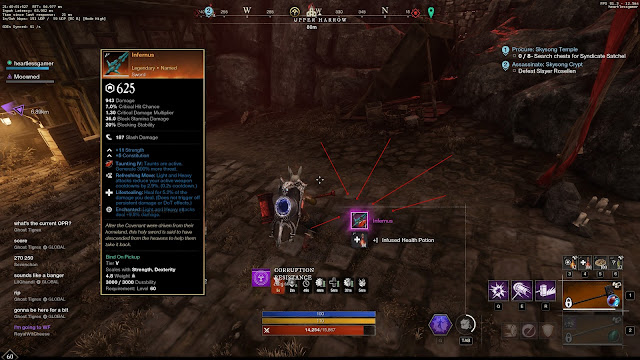
Second; USER INTERFACE! We saw USER INTERFACE! Finally. The UI is critical to understanding the game. We saw two stacked hot bars, some indication of equipped weapon, cool downs, and a little bit of the inventory. UI needs to be featured more. It is the biggest missing piece to help drive confidence the game is making more progress than just being able to show off animations and basic combat.
We also got to see a few other things. Most notably was the gliding (flying?) mount (23:12 in the video). The animation from take off, gliding, to landing were awesome. Enemies also aggro'd as the mount glided or walked past and there was quite the train of enemies gathered up. I am not sure if this is how aggro is intended in long run, but definitely some early-days MMORPGs vibes there!
Also numerous times in the video we got to see the character traverse various world obstacles. The traversal looked smooth and gave me confidence that they are headed in the right direction for movement and how it feels to the player (i.e. I can climb that rock in front of me vs it being an invisible wall).
This is the first class preview where I can give a solid "thumbs up". The more of the various game aspects that are mixed into these previews the more confident I will be that the game is heading towards a test!

